Willem de Kooning and Easter Monday
April 3, 2019
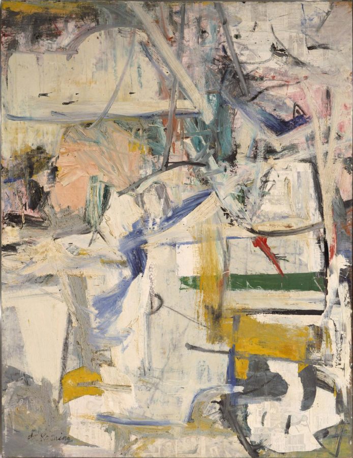
Willem de Kooning was an American painter who was born in the Netherlands in 1904’s. He studied at the Rotterdam Academy of Fine Arts and Techniques and became a leader in the abstract expressionist movement in the 1940’s. In the latter half of the 1950’s, he moved onto nonfigurative work, which was when he created his piece Easter Monday, but he subsequently reverted back to painting the female figure and landscapes in the 1960’s when he moved to Long Island. Willem de Kooning painted Easter Monday, which stands at 8’ x 6’2”, from 1955 to 1956. The painting is currently housed at the Metropolitan Museum of Art in New York. The title refers to the day it was finished in 1956, which was the day after Easter Sunday. The title lends itself well to the colors de Kooning chose to use; there is an abundance of cloudy whites and bright blues, pinks, yellows, and greens, which are typically associated with Easter. Alternatively, there is a significant amount of dark gray and black, which may be commentary on the “abstract urban landscape,” a term coined by art critic Thomas Hess, which is what this painting embodies. This is an accurate term because there is a certain type of motion in this painting that can only be found in the fast paced life of a city. It is clear that with the newspaper transfers, the bold streaks of paint, and the specific colors that de Kooning was trying to emulate the feeling of the hurried urban lifestyle.
De Kooning used newspaper transfer to create the surface he painted on. The newspaper is noticeable throughout the painting; the viewer can see the faint shadows of newspaper headlines and the faces of people in the advertisements. Although the newspaper transfers are noticeable throughout, they are particularly noticeable in the top right and bottom right corners. De Kooning applied these transfers in a grid-like manner, rather than haphazardly placing the transfers, which reinforces the grid-like structure of the composition.
There are strong horizontals strategically placed, particularly the bright green horizontal in the bottom right half of the composition. The horizontal is mimicked directly above and below the green line with the gray horizontals. Similarly, there are shorter horizontals in the bottom left corner of the composition, which are less dominant than the green horizontal. There is a bright blue horizontal, which is distinct against the gray plane that it lies on. This bright blue horizontal is imitated just above it with a pale gray horizontal. Notably, this horizontal is much shorter than the previous horizontals, but it cuts through a yellow plane, which is not yet seen in this composition. The green horizontal and the blue horizontal lie on the picture plane, but with this pale gray horizontal, de Kooning has it cut through two different planes. There are many more horizontals that lie throughout the painting that are not as evident, but still help the viewer’s eye move throughout this grid-like structure. The manner in which de Kooning applied the paint is crucial to the outcome of the painting. In some areas, the paint is applied so thick and opaque that the areas become flat, particularly the green horizontal and the yellow plane in the bottom left that is interrupted by the pale gray horizontal. These areas are so calm and quiet compared to the rest of the painting, which is noisy and energetic. In other areas, the paint is thinned out so much that the viewer can see layers below. This is the case for the areas where the newspaper transfers are visible. In the bottom right corner there is an irregularly shaped white plane that is outlined by black, yellow, and green. The white paint applied over the newspaper transfer is so transparent that the viewer can easily make out the words of the advertisements and the faces of the people photographed. In the bottom left corner of the painting, there are dull blue planes and lines, in which the paint seems to curdle up on the canvas. It becomes chunky, unlike the other forms of application de Kooning experimented with on this canvas. This chunky consistency also appears in the middle of the painting, on the white diagonal that lies just above the yellow vertical stroke. Black paint is scuttled on the final layer of the painting. These different paint applications are crucial to the boisterous feeling of this painting, a feeling that is ever-present in urban life.
Willem de Kooning used Easter Monday as a way to communicate the exuberant feeling of existing in an urban environment. Whether or not this was intentional, he also communicated the feeling of rebirth through his title and the colors he chose. This painting is no different from the rest of his works in the sense that they are strongly passionate, intense, and unrefined. Easter Monday is another early success from Willem de Kooning.


Raymond Cote • Sep 28, 2020 at 5:10 pm
Decadent ; I remembered in 100 years.